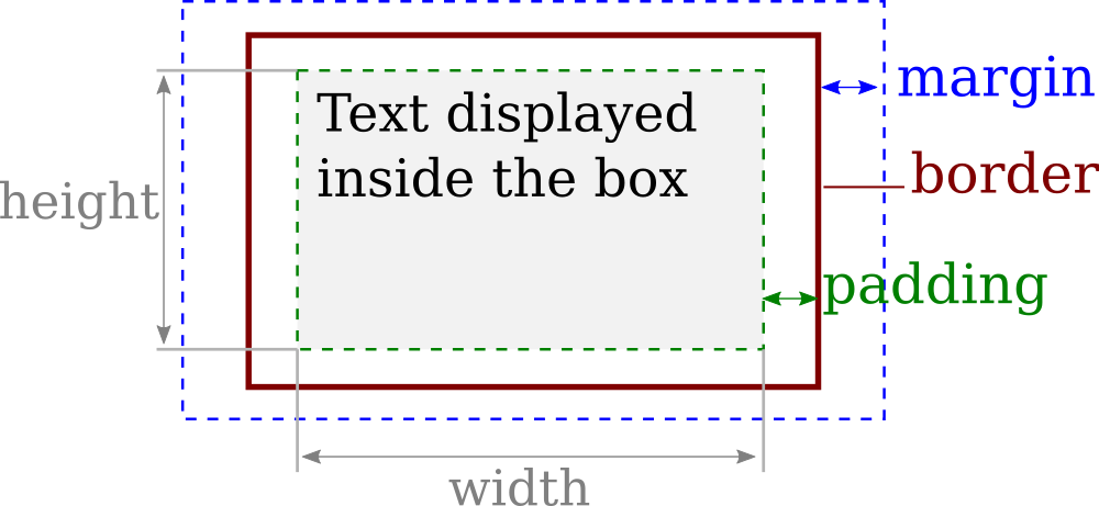
Box Model
Each HTML element can be seen as a container with visual behavior following the so called
HTML Box Model, defining the rectangular region occupied by an HTML element.
A box is geometrically associated to three main visible attributes
-
Margin: Empty space between the neighboring (or parent) box and the current one
-
Border: Boundary of the rectangular box.
-
Padding: Empty space between the border and the content inside the box.
Note that the
width and
height of a box correspond to the dimension of its content (excluding padding and margin)
-
- Box attributes can be set globally on all sides (ex. margin:10px;), or in separated way for the left, right, top, and bottom side (ex. margin-top:10px; margin-left:30px;).
-
- HTML elements are containers themselves, and can contains other ones. We can therefore display boxes within boxes, etc.
Display
Websites contain a large variety of visual elements (text, images, etc.) which follows different behaviors. In some cases, the box itself has a specific meaning, and its dimension may be directly specified by the user. In other cases, the box itself has no meaning without internal content, thus its behavior is defined by its content.
-
- For instance, words in paragraphs should by default flow from left to right, and then from top to down when reaching the end of the line.
-
- Titles, on the opposite are displayed by default from top to down. Each new title is defined on its own line.
-
- Images, are displayed from left to right like words from paragraphs. However, at the opposite of words, their dimensions such as width and height should be fixed by the user, and not necessarily by their content.
These different behaviors are related to three main display styles:
inline,
inline-block, and
block. (
more information on layout).
Block
Block elements elements that spans an entire line.
-
- Consecutive blocks are displayed from top to bottom.
-
- Block element can have user defined dimensions. Its height define the dimension of the line which spanned.
-
- Any new element after a
block element is displayed on the next line. The line containing a block element is dedicated to it.
-
- Block elements can contain themselves any other type of elements (inline, inline-block, and block).
Containers of texts such as titles <h1>, ..., <h6>, as well as paragraphs <p> have block display by default. You can force any element to have an block display in css using
.selector {
  display: block;
}
<h1> A Title </h1>
<h2> A sub-title </h2>
<p> In this paragraph, the tag <strong>strong</strong> is set to have a display: block;</p>
Inline-block
Inline-block elements are rectangular box from which size (width, height), margin, padding can be fully defined by the user.
-
- Inline-block elements flow left to right, and go automatically to the next line when needed.
-
- Inline-block elements can contain any other type of elements (inline, inline-block, and block).
Images have inline-bloc display by default. And you can force any element to have an inline display in css using
.selector {
  display: inline;
}
-
rem. By default, the inline-block box that are on the same line are positioned vertically such that their baseline (bottom of standard text line, and bottom of image) are aligned. This property can be modified with
vertical-align.
Inline
Inline is used to display element with a
text-like behaviors.
-
- Inline elements flow left to right, and go automatically to the next line when needed.
-
- Inline elements can contain other inline elements, and their width and height automatically adapts to their content.
-
- Inline elements should not contain block or inline-block elements, this will create incorrect layout.
-
- Padding and margin are acting on left and right side, but do not work on top and bottom.
-
-
Text height depends on the font, and the space between two lines can be set via line-height instead.
Tags highlighting words with some properties such as <a>, <em>, <strong> have by default inline display behavior.
ex.
Links have <a href="https://www.w3schools.com/cssref/pr_class_display.asp"> inline display</a>.
<em> Emphasized </em>, or <strong> strong </strong> highlighted words have also inline display.
<a target="_blank" href="."> Strong <strong>links</strong> are neasted inline elements. </a>
You can force any element to have an inline display in css using
.selector {
  display: inline;
}
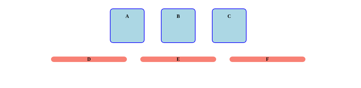
Neasted blocks
The following example shows the behavior of neasted boxes depending on their respective display.
The page contains:
-
- Two containers depicted by the gray boxes.
-
- Each container has six children Elements A-F.
A set of button allows to change the type of display of the container, and the elements. A checkbox also allows to force the width of the container to be set at 40% of the page width.
Wepbage
-
- Container:inline-block, Element:block
-
-
All elements are on top of each other. The containers are along two columns with width given by the size of the element.
-
- Container:block, Element:block
-
-
The container now take the whole line width of the webpage. Each element take also the whole size of its container, and therefore spread to the entire line.
-
- Container:inline-block, Element:inline-block
-
-
The elements are now flowing from left to right inside the container (is the screen space allows it). The container adapts its size to fit all its content. Depending on the width of your screen, the containers may be next to each other, or one on top of each other. If you set "Set width to 40%", then the two containers can be on the same line.
-
- Container:block, Element:inline-block
-
-
The elements still flows from left to right. The container span the entire line. Not that even if the width of the container is set to 40%, the next container will be on the next line.
-
- Container:block/inline-block, Element: inline
-
-
The elements are one after the other. There is no margin by default between the elements, and the space on top/bottom of the element disapears.
-
- Container: inline, Element: any:
-
-
The container is not able to wrap correctly the size of the internal boxes. Inline container should only be used to wrap inline elements without constrained dimensions.
Exercise 1
Consider the following HTML
Set the following CSS code to create a visible box around the paragraph.
p {
  display: inline-block;

  /* set dimension of the box */
  width: 120px;
  height: 100px;
  padding-top: 20px;

  /* Set color and border */
  background-color: cyan;
  border: 2px solid blue;
  border-radius: 10px;
}
Adapt the HTML code, and CSS padding, and margin of the paragraph element to have the following result:
Exercise 2
Consider the following HTML body
<section>
  <p> A </p>
  <p> B </p>
  <p> C </p>
</section>
<footer>
  <p> D </p>
  <p> E </p>
  <p> F </p>
</footer>
-
> Create a CSS file to model the following appearance
 When appropriate, don't forget to avoid code duplication in factorizing common properties within the same rule.
Tips:
When appropriate, don't forget to avoid code duplication in factorizing common properties within the same rule.
Tips:
-
- text-align: center; Center content inside the container (Note: it centers the content inside the element, but not the element itself).
-
- font-weight: bold; Set the text font to bold