7/13
3. Box Model
Each HTML element can be seen as a container with visual behavior following the so called HTML Box Model, defining the rectangular region occupied by an HTML element.
A box is defined by 3 attributes
-
Margin: Empty space between the neighboring (or parent) box and the current one)
-
Border: Boundary of the rectangular box.
-
Padding: Empty space between the border and the content inside the box.
Note that the width and height of a box correspond to the dimension of its content (exluding padding and margin)

-
Box attributes can be set globally on all side (ex.
margin:10px;), or in separated way for the left, right, top, and bottom side (ex.margin-top:10px; margin-left:30px;). -
HTML container can themselves contains other ones. We can therefore display boxes within boxes.
Display
Websites contain a large variety of visual elements (text, images, etc.) which follows different behaviors. In some cases, the box itself has a specific meaning, and its dimension may be directly specified by the user. In other cases, the box itself has no meaning without internal content, thus its behavior is defined by its content.
-
For instance, words in paragraphs should by default flow from left to right, and then from top to down when reaching the end of the line.
-
Titles, on the opposite are displayed by default from top to down. Each new title is defined on its own line.
-
Images, are displayed from left to right like words from paragraphs. However, at the opposite of words, their dimensions such as width and height should be fixed by the user, and not necessarily by their content.
These different behaviors are related to three main display styles: inline-block, block, and inline.
Inline-block
Inline-block elements is a rectangular box from which size (width, height), margin, padding can be fully defined by the user. Consecutive inline-block elements are displayed from left to right. Images have inline-bloc display by default.
-
Run the html webpage with the following body (code)
<img src="HTML5_Logo_128.png">
<img src="HTML5_Logo_128.png">
<img src="HTML5_Logo_128.png">
Note that each element is placed from left to right. If you shrink the window width, elements exceeding the size of a line are automatically placed on the next line.
-
Add the following content in the CSS file in order to visualize each box separately
body {
    background-color: rgb(240,240,240);
}
img {
    background-color: cyan;
    border: 2px solid blue;
    padding: 10px;
    margin: 20px;
}
Note the cyan space between the box border and the content (here the image) indicating the action of the padding.
Change the size (width, height) of the image and observe the results.
Block
Block display is used to render elements that span an entire line. Consecutive blocks elements are displayed from top to bottom, a new line is started at each new elements. Blocks can have user defined size and margin. Containers of texts such as titles <h1>, ..., <h6>, as well as paragraphs <p> have block display by default.
-
Run the html webpage with the following body (code)
<h1> Title </h1>
<h1> Another title </h1>
<h2> A sub-title </h2>
<p> A text paragraph </p>
<p> A longer text paragraph. ex. from Moby Dick: ... </p>
Note that each element is displayed on a new line.
-
Add the following content in the CSS file in order to visualize each block structure
h1 {
        background-color: yellow;
        border: 2px solid blue;
}
h2 {
        background-color: orange;
        border: 2px solid red;
        height: 80px;
        width: 200px;
}
p {
        background-color: rgb(200,200,200);
        border: 2px solid black;
        padding: 15px;
        margin: 30px;
        width: 800px;
}
Note that when the width is not explicitely specified, the container expands along the entire width of the parent element (here the size of the window for <h1>).
Inline
Inline is used to display element with a text-like behavior. Inline element has width and height that adapts to its content and cannot be set from the CSS style. Padding and margin are acting on left and right (similarily to margin in written paper), but are not adapted to work for top and bottom.
Tags highlighting words with some properties such as <a>, <em>, <strong> have by default inline display behavior.
-
Run the html webpage with the following body (code)
<p> Links have <a href="https://www.w3schools.com/cssref/pr_class_display.asp"> inline display</a>.</p>
<p> <em> Emphasized </em>, or <strong> strong </strong> highlighted words have also inline display. </p>
Note that inline elements are placed within the sentence in the flow of the text from left to right.
-
Add the following CSS content allowing to visualize the boundaries of the boxes (remember that
+<p>+ has a block display).
a {
        border: 2px solid blue;
        background-color: lightblue;
}
em {
        border: 2px solid green;
        background-color: lightgreen;
}
strong {
        border: 2px solid red;
        background-color: pink;
}
p {
        border: 1px dashed gray;
        padding: 5px;
}
Add a margin on some inline element. Note that it acts on the left and right margin, but not on the top and bottom, which are ignored. At the opposite of inline-block, the height of inline element is defined by its content, and not by the container itself.
Add a padding on an element. Note that the padding propagates on the top and bottom, but doesn’t change the placement of the surrounding elements.
Note: line-height can be used to set the vertical space between lines of text.
Adapting the display
While HTML tags have default display behavior, it can be changed through CSS.
-
Consider the following code [source code]. Observe that the default display behavior is modified for <a>, <h1>, <p>, and <img>. Comment the CSS to see the default behavior.
Changing the display allows you to set the most appropriate behavior of your element with respect to the neighboring one. When designing a webpage, you should carefully plane what display is the most appropriate for your element.
Changing the display allows you to set the most appropriate behavior of your element with respect to the neighboring one. When designing a webpage, you should carefully plane what display is the most appropriate for your elements.
Exercise
Consider the following HTML body
<section>
        <p> A </p>
        <p> B </p>
        <p> C </p>
</section>
<footer>
        <p> D </p>
        <p> E </p>
        <p> F </p>
</footer>-
Create a CSS file to model the following appearance
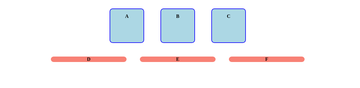
When appropriate, don’t forget to avoid code duplication in factorizing common properties within the same rule.
Tips:
-
text-align: center; Center content inside the container (Note: center children of the element, but not the element itself).
-
border-radius: 10px; Create a round border instead of a rectangular one.
-
font-weight: bold; Set the text font to bold